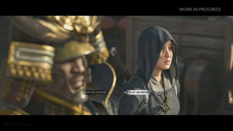
Assassin’s Creed Shadowsbears the influence of games throughout the franchise, but one particularly big element of its style is a direct result ofAssassin’s Creed Odyssey’s approach. The franchise’s first venture into Japan is being developed by Ubisoft Quebec, the same studio behindOdyssey, so it’s no surprise that there’s a lot of continuity in its ideas. While Sengoku period Japan and Ancient Greece are radically different, every aspect of presentation doesn’t necessarily have to be.
In aninterview withScreen Rant,art director Thierry Dansereau explained that the game’s focus on vivid colors was informed byOdysseyand its reception.Assassin’s Creedhasn’t always been the most colorful series, butOdysseywas often vibrant, and players' responses to that element carried over into the design ofShadows.

Thierry Dansereau: Me, I would say personally it comes from the lessons learned on the making of Assassin’s Creed Odyssey. We saw, even on Reddit and channels like that, players feel great when there’s colors. And you love to be in a world that’s worth saving. So you want to spend time where you feel great.
The team didn’t swerve into a cartoon fantasy, and Dansereau also explains that the colorful nature of the setting was obvious when visiting Japan and considering references. Instead,the developers “just slightly pushed it,“particularly when it comes to highlighting the changing seasons in the game.

Odyssey & Fans Both Influenced Color In AC Shadows
Positive Feedback Is Important
The focus on color is particularly notable when comparingAssassin’s Creed Shadowsto theearliest entries in the series, which leaned toward desaturation in some regards. While this element established a visual brand that synchronized with the concept of the Animus, it didn’t ultimately stick around for the long haul.
Assassin’s Creed Shadows' Art Director Reveals The “Biggest Scale Ratio” Of The Open-World AC Games
Assassin’s Creed Shadows is setting one record for the open-world games in the franchise’s, and it’s all because of Japan’s mountain ranges.
Thierry’s explanation makes perfect sense, as vivid colors are a particularly easy way to release dopamine, but it’s particularly interesting to see that fan environments like Reddit helped influence the way thatAssassin’s Creed Odyssey’s design choicesplayed intoShadows.Although negative feedback can often pick up more traction online, positive responses can clearly also make themselves heard.

Assassin’s Creed Shadows' Vibrant Color Is A Good Approach
I don’t think saturation for the sake of it is a good thing — a few online games that feel desperate to stimulate come to mind — but I’m definitely into the approach thatAssassin’s Creed Shadowstakes. Elsewhere in the interview,Thierry Dansereau mentioned Kurosawa’sRan, a film that uses striking color to great results. While the nudge in saturation might not be to everyone’s taste, it does feel like the color is deployed smartly in a way that evolvesOdyssey’s approach.
That doesn’t mean the whole franchise will follow in the direction thatOdysseyandShadowshave, and color is definitely a location-dependent element. Like Dansereau says, though, it comes from a very natural place when the focus is on Japan, and I’m excited to see the full scope of whatAssassin’s Creed Shadowsdoes with its seasonal hues.


